Speaking our language: How Vidit Bhargava designed LookUp in Sketch
We speak to the award-winning designer about his popular dictionary app, his creative process, and why Sketch is his go-to tool
Giving you the tools you need to create great work is what drives us to make Sketch better every day. And when we see the things that you create with Sketch, it inspires us to do even better. One of our goals is to highlight great design, so this week we chatted to Vidit Bhargava — the designer and developer of LookUp, who appeared on Apple’s ‘20 under 20’ developer list in 2015.
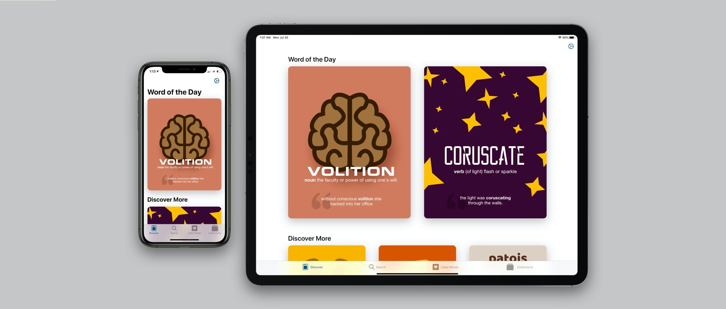
LookUp is an award-winning dictionary app for iOS, Mac and Apple Watch that encourages you to learn a new word every day. It uses beautiful, illustrated cards to help explain the meaning — and Vidit designs everything from the UI to each individual card in Sketch.
Can you tell us a little about where you started in app design, and when you started using Sketch?
I started designing when I was in high school. I designed and maintained an e-magazine for students to keep abreast with technology news and to catch up on trivia, and I took part in several inter-school web designing competitions. I really enjoyed the creative process behind organizing content, creating beautiful graphics, and making easy-to-navigate web pages.
I am also a long time Apple fan, so I was extremely excited when the iPhone first came out. Its design was everything I loved about Apple products. Simple, beautiful and easy-to-use. I was instantly a fan of the device and its apps.
When the iPhone SDK launched, I was very encouraged by the idea that I could build and ship something to thousands of people worldwide. My passion for web design quickly translated to app design.
I discovered Sketch through Twitter a few weeks before LookUp shipped. I don’t think I’ve ever used any other tool for creating interfaces since.
I started playing with Interface Builder in Xcode to create different layouts, but I gradually started using other design tools to iterate on my designs faster and work more on details. I’d spend hours meticulously designing different screens for the apps I wanted to bring to life. I didn’t program then, but my brother was a computer science major, so I’d often help him by creating mockups and assets for his college projects.
At the time, my go-to tool for UI design was Photoshop, and while Photoshop is great at a lot of things, it’s not really designed for UI design. I started to feel the need for something more dedicated, and I discovered Sketch through Twitter a few weeks before LookUp shipped. I don’t think I’ve ever used any other tool for creating interfaces since.
Who (or what) are your biggest design inspirations?
My biggest inspiration has been the iPhone and the designers who created the UI for it. The simplicity of the designs enables anyone to just pick up the devices and start using it. The iPhone’s ‘slide to unlock’ interface was so intuitive, my two-year-old nephew could use it. It’s that level of ease-of-use that I strive for as a designer.
Imran Chaudhri, the designer who worked on ‘slide to unlock’ and hundreds of other interfaces on the iPhone and Mac is also someone whose work deeply inspires me. I am still amazed at just how those interfaces must have come to life. And Mark Kawano, too. His (now discontinued) app, Storehouse, came out just as I was getting started in app design, and the fluidity of the interface, and the simplicity of the app was very inspiring.

Vidit has worked hard to make his app’s interface as simple as possible, and to stay close to Apple’s own high standards. His latest release adds widget functionality to the iPhone and iPad.
Currently, I just love using the Moleskine apps. They’re designed by Bonobo Labs, and their designs are just amazing. The sound design, the haptics, and the interactions are just phenomenal — they’ve created a truly modern iOS app experience.
How did you get started with LookUp? Did you ever think it would be as popular and successful as it has been?
My brother and I used to share an 8GB iPod Touch back in 2012. I was in my final year at high school and was studying for my finals. When I studied, I’d often use a dictionary to learn and understand the meaning of various words, but dictionary apps at that time took up more than 200MB of storage, and were cluttered with a lot of features I didn’t need. Then I’d end up using Google, because I’d often want to look at an image to better understand the words.
The experience of looking up a word on the iPod was antithetical to the experience of using my iPod. I wanted a dictionary app that was as delightful and easy-to-use as the iPod and iOS itself. I wanted everything in a single search — without a lot of junk features. So the idea of Lookup was born.
The last few years have definitely been more successful than I had ever hoped LookUp would be, and it’s been an iterative process with lots of learning on the fly. If you were to tell 18-year-old me that just a few years down the line this is what I’d be doing full time, I’d have laughed at the idea!
What is it that’s kept you coming back to Sketch over the years?
Sketch pays just as much attention to detail and design as its users. It’s native, fast and is improving consistently. And it feels at home with the rest of the apps on the platform. That’s something I think is a deeply under-appreciated quality in productivity apps.
A couple of years ago, when I was redesigning the app, Sketch played an important role in creating a consistent experience. I relied on Symbols, Layer Styles and Text Styles to do that. Reusing Components also meant faster iterations. I was able to put together a system that I still use to help me design for LookUp quickly.
How important was design when you were creating the app, and how did Sketch help you create something you were happy with?
From its inception, design has been a core focus for LookUp. The idea was to create an app that solved the user’s needs, and provided what they were looking for in a clear, simple interface. And that’s stayed true for the app over the years.
Every time there’s a major new feature to add to the app, I still find myself taking a step back and looking at the app from the perspective of a new user. Is there too much going on in the app? Is there too much explanation to do on first launch? How easy is it for the user to just get started without being overwhelmed by everything that’s on the screen?

A lot of the design cues are taken directly from Apple — it’s easy to see why the app has been featured so many times on the App Store, and won so many awards.
Each new addition to the app is designed and prototyped rigorously. The design process involves a lot of iterations, on-device previews, programming a usable version of the feature and collecting feedback to make further changes to the design and functionality.
Sketch has played a significant role in helping me design the app over the years. It’s easy to quickly jump in and draw an interface and iterate on it before launching Xcode and programming something.
A couple of years ago, when I was redesigning the app, Sketch played an important role in creating a consistent experience. I relied on Symbols, Layer Styles and Text Styles to do that. Reusing Components also meant faster iterations. I was able to put together a system that I still use to help me design for LookUp quickly.
Every time there’s a major new feature to add to the app, I still find myself taking a step back and looking at the app from the perspective of a new user. Is there too much going on in the app? Is there too much explanation to do on first launch?
Over the years I’ve also set up Sketch Plugins to pool in more realistic dummy data that closely mimics the app’s functionality instead of just using placeholder text.
Another key area where Sketch has helped me immensely is LookUp’s Word of the Day images. Sketch is an unusual tool for such illustrations but the speed with which I can construct vector graphics on Sketch, and the ability to reuse shapes and objects has made it a perfect tool for creating the Word of the Day images for LookUp.
You mentioned plugins, there — which ones do you use the most in your workflow?
My current favorites include the Data Populator Plugin by precious design studio, and the Rotato and Vectory plugins to quickly generate 3D graphics and showcase the designs in short videos.
The Data Populator plugin is a great way of quickly populating mockups with real data. It can link to JSON files and with a little bit of modification, you can have mockups that use real-world data instead of random images and ‘lorem ipsum’.
How did you find the process of adapting the iOS app to other devices?
LookUp started as an iPhone app that was specifically designed for the one screen size that the iPhone offered at the time. Over the years, as the number of screen sizes has increased, and as devices like iPads have embraced multi-window and split screen interfaces, it’s become imperative to think of apps as more fluid and adaptive interfaces instead of static screens of different sizes.
But layouts are only one part of the story. Each platform has subtle nuances that need to be taken into consideration when designing an interface for that platform.

Vidit knows each version of the app needs its own considerations — because users interact with their device in different ways.
On the iPad, the app adopts a multi-column layout as opposed to the single column layout on a smaller device. But it also goes beyond that to create an interface that’s truly at home on the iPad.
For example, on the iPhone LookUp presents a sheet-style presentation for adding words to a collection. On the iPad however, that presentation is changed to a popover. Making the interaction just as quick, without presenting a large sheet for a user to take action on.
When designing for the Mac, the challenges were different. It was a paradigm shift from a touch-screen device to a point-and-click device. While the core functionality of the app was the same, each element was redone — keeping in mind that people would be using a trackpad or a mouse.
For example, the iOS app relies on taps, progressive disclosures and navigation from one screen to the other. On the Mac, it’s just faster to have a split-screen flat navigation that eliminates big changes to the screen every time you click on something.
People also have a strong mental model of what they expect from a Mac app. So it was also important to have an app that looked and worked like a Mac app and not an iOS app ported to the Mac.

The Watch version of the app is designed for quick interactions to minimize distractions as much as possible.
On the Apple Watch, LookUp’s priorities have been completely different. They’re all about glanceability and super fast interactions. No one likes to lift their wrists for more than a few seconds, let alone carrying out complex interactions on that small a screen, so I designed LookUp to be an app that you can use quickly in a distraction-free environment.
What advice would you give to young developers that are thinking about getting into app development and design?
When starting with app development, it’s too easy to get demotivated by initial failure or not being able to meet expectations on first launch. But what I’ve discovered is that the initial response to an app is a very small part of a much bigger journey. Constantly iterating, striving to be better and staying curious is what makes the process fun and rewarding.
This is the latest in our #MadeWithSketch series. If you have a project you’ve created in Sketch and want to share with us, let us know on our social channels.